Power BI
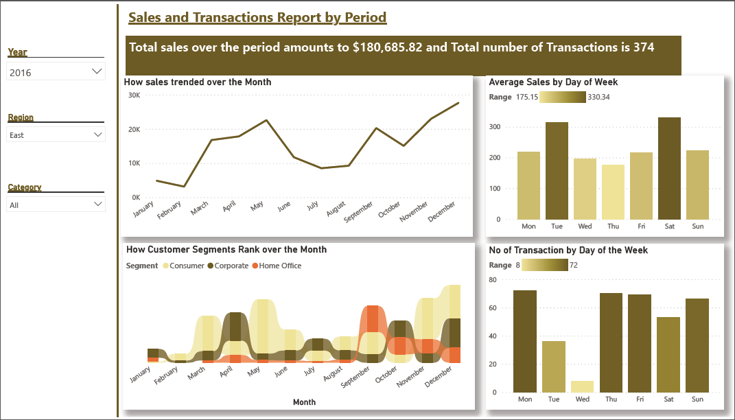
Sales and Transactions Report by Period Total sales over the period amount to $180,685.82 and the Total number of Transactions is 374.
Overview: According to the United Nations, Climate change refers to long-term shifts in temperatures and weather patterns. Such shifts can be natural, due to changes in the sun’s activity or large volcanic eruptions. But since the 1800s, human activities have been the main driver of climate change, primarily due to the burning of fossil fuels like coal, oil, and gas. This project seeks to Predict the CO2 levels (at each African region) in the year 2025, also to determine if CO2 levels affect annual temperature in the selected African countries.

Business Background: Vivendo is a fast food chain in Brazil with over 200 outlets. Customers often claim compensation from the company for food poisoning. The legal team processes these claims. The legal team has offices in four locations. The legal team wants to improve how long it takes to reply to customers and close claims. The head of the legal department wants a report on how each location differs in the time it takes to close claims.

Business Questions: The Business Executives Want To Know:

The Covid-19 pandemic was unprecedented and claimed numerous lives. I embarked on a journey to gain insights into the global impact of Covid-19. The datasets utilized for this project were sourced from the World Health Organization (WHO). The analysis was conducted using Microsoft SQL Server.
The following questions are what this analysis seeks to answer:

This project showcases how various departments within the organization can enhance the efficiency of scheduling and conducting technical maintenance activities.
The Social Media Management Tool Project was a research endeavor I conducted to produce a report containing actionable insights for my team regarding the Social Media Management Tool project we were developing. This project, known as Synkify, aimed to facilitate businesses in integrating all their social media platforms within a unified user interface. The ultimate goal was to enhance interactions between businesses and customers, optimizing their effectiveness.
The dataset of this project was a collection of data from web research. The analysis was done in Excel and visualization was done in Tableau.
I have utilised Tableau for various projects, these projects encompassed various domains, including Udemy courses analysis, Sprocket Central Pty Ltd, Social Media Management Tools and their capacity analysis, Covid-19 Project Dashboard and more.

The following highlights Sales transactions over the period of 4 years:
This analysis and visualization was done on Power BI.
Most stakeholders' primary focus revolves around insights. It has been proven that conveying insights through images is more comprehensible than using figures alone. Therefore, I've extensively researched optimal chart formats for various audiences and the unique aspects of the insights to be communicated.
Here are a few dashboards and Charts I created using Python, Power BI, Tableau, and Excel